Monday

Unclassed Choropleth Maps


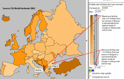
The unclassed choropleth map to the left is one that shows fertility rates in Europe. However, because it is an unclassed choropleth map, the shading of other countries fertility rates are directly related to the country with the highest fertility rate....which sets the shade so to speak.

Standardized Choropleth Map


The standardized choropleth map to the left was found at the BBC website. It was described as a population density map. It shows the average density across regions.

Its URL is: http://www.bbc.co.uk/scotland/education/bitesize/standard/geography/population/distribution_density_rev3.shtml

DOQQ


The DOQQ map to the left is pointing to the Department of Conservancy in Sacramento, California. DOQQ maps are so highly praised for their degree of accuracy that older paper maps are being proved to be incorrect.

DRG


This DRG is of "Crater Lake West" and "Crater Lake East" in Oregon. This DRG was obtained by utilizing the DEM and DLG (previously posted) of this same crater lake.


DLG


The image to the left is a road DLG of "Crater Lake West" and "Crater Lake East" in Oregon. The Road DLG was apparently obtained by being draped over the previously published DEM of the same crater.

Its URL is: http://images.google.com/imgres?imgurl=http://oregonexplorer.info/craterlake/images/dlgv32/drg_cle.gif&imgrefurl=http://oregonexplorer.info/craterlake/dlgv32.html&usg=__tZ1bocyPjhbsQPSo448gmqqw_Oc=&h=660&w=454&sz=53&hl=en&start=9&um=1&tbnid=aZn1Mu7xb6Mc-M:&tbnh=138&tbnw=95&prev=/images%3Fq%3DDRG%26hl%3Den%26rls%3Dcom.microsoft:*:IE-SearchBox%26rlz%3D1I7GZFA%26sa%3DN%26um%3D1

DEM


The DEM to the left is of "Crater Lake West" and "Crater Lake East" taken in Oregon. This image was actually created by overlapping multiple images capture by a program called the DLGV32 Viewer.

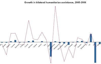
Bilateral Graph


Lorenz curve


The Lorenze curve to the left was done by PennState. This curve is based on a country with a apparent unequal distribution of income. One of the most powerful things that this reveals is how rapidly the corruption increases at the highest percentage of the income population.

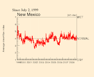
Index Value Plot


The graph to the left is an index value plot. It was a division under direction of the New Mexican government plotting their stream flow (water) index. This graph shows almost ten years of their flow index, and therefore allows the viewer to have a pretty good idea of what the average water flow index is.

Isopleths


The isopleth graph to the left is an ozone isopleth created by individuals concerned about the pollution levels of North Carolina. It was created by using a computer model based on ChemTest.

Isopach


The map to the left is an isopach map that was created, mainly, by the use of a computer. This is an isopach of a small gas field. The viewer is able to see the thickness and type of ground that must be gone through in order to obtain this raw material.

Its URL is: http://images.google.com/imgres?imgurl=http://www.cartage.org.lb/en/themes/Sciences/Earthscience/Geology/OilandGas/HydrocarbonExploration/GeologicMaps/SANDSTONE_MAP.jpg&imgrefurl=http://www.cartage.org.lb/en/themes/Sciences/Earthscience/Geology/OilandGas/HydrocarbonExploration/GeologicMaps/GeologicMaps.htm&usg=__UPaxT15sRBnrL8y-KB9zJIjdBrU=&h=422&w=563&sz=33&hl=en&start=14&um=1&tbnid=QOJCxZmitCcuoM:&tbnh=100&tbnw=133&prev=/images%3Fq%3Disopach%26ndsp%3D18%26hl%3Den%26rls%3Dcom.microsoft:*:IE-SearchBox%26rlz%3D1I7GZFA%26um%3D1

Isohyets


The isohyet to the left is from the Hong Kong observatory in 2003. It was/is used to gauge the rainfall distribution in millimeters.

Isotachs


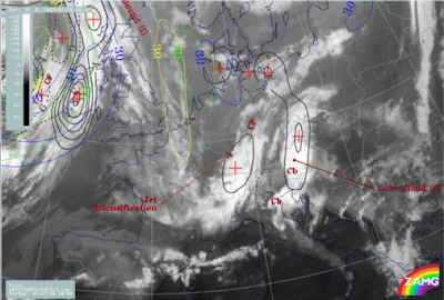
To the left is an Isotach image that was created July 29, 1997 in (and for) Austria. This was taken from a website that actually is for meteorologists in Austria.

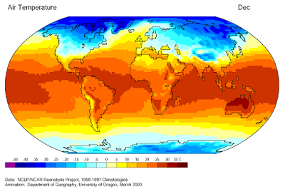
Cartographic Animations


The cartographic animation to the left, when seen in motion, shows the air temperature from 1959 through 1997. This was created, or at least published, by The University of Oregon in March of 2000. What the viewer can see is an actual progression of all the months of all the years that this study contains data for.

Its URL is: http://images.google.com/imgres?imgurl=http://uwacadweb.uwyo.edu/JSHINKER/animations/global/gifs/vmag500winds_web.gif&imgrefurl=http://uwacadweb.uwyo.edu/JSHINKER/animations/global/index.html&usg=__c6-ISlNc9_abWLDpvtG-AaXqeAo=&h=458&w=674&sz=455&hl=en&start=14&um=1&tbnid=SttdNmDh9QuDBM:&tbnh=94&tbnw=138&prev=/images%3Fq%3Dcartographic%2Banimations%26hl%3Den%26rls%3Dcom.microsoft:*:IE-SearchBox%26rlz%3D1I7GZFA%26sa%3DN%26um%3D1

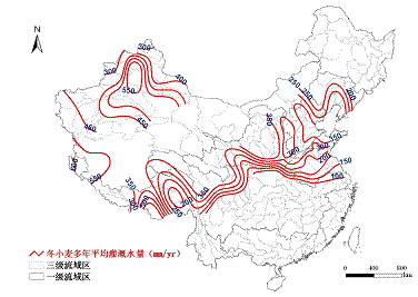
Isoline Map


This is an isoline map of China. It displays the average water amounts used for winter wheat irrogation across these regions.


The URL for this map is: http://www.iwhr.com/webadmin/uploadfiles/wuhy2008714174748275.gif

Hypsometric Map
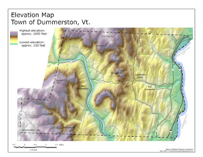

This map is a hypsometric, elevation, map of the town of Dummerston, Vermont. It shows the elevation progressions of this town by using various colors to indicate the progressions. This map also uses isohypses to show progression as well. This map was updated January of this year.
The URL for this map is: http://mappery.com/maps/elevation-map-of-dummerston-vermont.thumb.jpg

Cadastral Map


This is a Cadastral Map is that of an Irish District of San Pedro that was centered around a Catholic Church being built their. It was published no later than 1922, and was placed on display in Argentina, initially, to celebrate St. Patrick's Day in San Pedro.

Sunday

Star Plot


This is a star plot of selected peak ratios of chromatographic analysis of oil samples. This method of plotting is being used to show the differences between the samples.

Its URL is: http://images.google.com/imgres?imgurl=http://www.humble-inc.com/app99-2-fig4.gif&imgrefurl=http://www.humble-inc.com/rof_app99-2.htm&usg=__JMw9ULFCr4kmZdXRRuPCkhHydzE=&h=248&w=253&sz=7&hl=en&start=7&um=1&tbnid=XVlioHOIvOTxlM:&tbnh=109&tbnw=111&prev=/images%3Fq%3Dstar%2Bplots%26ndsp%3D18%26hl%3Den%26rls%3Dcom.microsoft:*:IE-SearchBox%26rlz%3D1I7GZFA%26sa%3DN%26um%3D1

Correlation Matrix


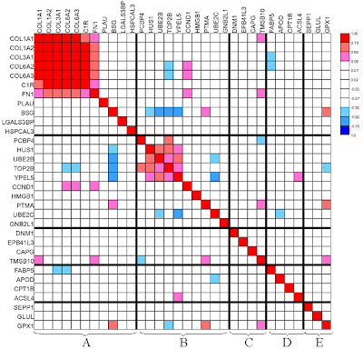
This is a gene to gene correlation matrix for a subset of 100 cancer genes. "Thick lines indicate blocks: A for extracellular matrix; B for nucleus and cell progression; C for actin cytoskeleton; D for fatty acid metabolism and E for glutamine/glutathioine/oxidative." (www.livestockgenomics.csiro.au/Genome_to_Phenome/)

Similarity Matrix


This similarity matrix is using genotypes in a matrix system, and can therefore highlight specific strain similarities and abnormalities. Two strains of DNA were used in order to compile the data.

Stem & Leaf Plot


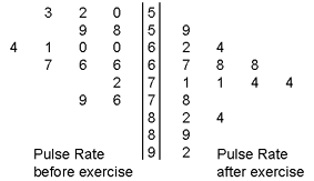
This is a back-to-back stem and leaf plot/graph. It is showing that one graph can be made from two different sets of data simply by keeping the numbers that do not change in the middle. For example, this graph shows pulse rate before and after exercise, but the middle numbers can be maintained, and therefore only one graph is needed instead of two.

The URL for this graph is: http://images.google.com/imgres?imgurl=http://www.tki.org.nz/r/maths/curriculum/statement/img/p210b.gif&imgrefurl=http://www.tki.org.nz/r/maths/curriculum/statement/glossary_e.php&usg=__ODKTW_zWVdWvBi680AlAKqFdAVk=&h=163&w=283&sz=7&hl=en&start=53&um=1&tbnid=0_rfOxpUjpSZAM:&tbnh=66&tbnw=114&prev=/images%3Fq%3Dstem%2Band%2Bleaf%2Bplot%26ndsp%3D18%26hl%3Den%26rls%3Dcom.microsoft:*:IE-SearchBox%26rlz%3D1I7GZFA%26sa%3DN%26start%3D36%26um%3D1

Parallel Coordinate Graph


This parallel coordinate graph is a gathering of financial data from companies ranging from Apple to Exxon Mobile over the course of one year. The graph demonstrates five sectors of these companies markets, and the data is presented in PCA code.

Its URL is: http://images.google.com/imgres?imgurl=http://courses.cit.cornell.edu/eceprojectsland/STUDENTPROJ/2007to2008/ak364/491_ak364/pca1.png&imgrefurl=http://courses.cit.cornell.edu/eceprojectsland/STUDENTPROJ/2007to2008/ak364/491_ak364/index.htm&usg=__CFmG9fk_pR5uvPJGbt1NqJ9GcXg=&h=420&w=560&sz=26&hl=en&start=31&um=1&tbnid=B6Nff-vemQsrCM:&tbnh=100&tbnw=133&prev=/images%3Fq%3Dparallel%2Bcoordinate%2Bgraph%26ndsp%3D18%26hl%3Den%26rls%3Dcom.microsoft:*:IE-SearchBox%26rlz%3D1I7GZFA%26sa%3DN%26start%3D18%26um%3D1

Box Plot


The following plot is that of data compiled from the New York Choral Society. It represents their height in compilation with their gender and their pitch.

Its URL is: http://images.google.com/imgres?imgurl=http://www.stat-or.unc.edu/webspace/courses/marron/UNCstat6d/Notes9-26-02/BoxPlotIntro2.jpg&imgrefurl=http://www.stat-or.unc.edu/webspace/courses/marron/UNCstat6d/Notes9-26-02/Notes9-26-02.html&usg=__QP9LyMah3R0Nn57HN6yYfA18waE=&h=606&w=1030&sz=38&hl=en&start=32&um=1&tbnid=rFJle_cQ2SHmGM:&tbnh=88&tbnw=150&prev=/images%3Fq%3Dbox%2Bplot%26ndsp%3D18%26hl%3Den%26rls%3Dcom.microsoft:*:IE-SearchBox%26rlz%3D1I7GZFA%26sa%3DN%26start%3D18%26um%3D1

Triangular Plot


This triangular plot is also another form of a scatter plot. This is a 3D. Because it is 3D it is able to show four different types of data compiled together in a spacial oriented manner.

The URL for this graph is: http://images.google.com/imgres?imgurl=http://www.amstat.org/publications/jse/02-046/systatn.jpg&imgrefurl=http://www.amstat.org/publications/jse/02-046/02-046_blind.html&usg=__Nv1QoLKn_vFk5Axf_Zhv5ogiGyU=&h=233&w=193&sz=12&hl=en&start=96&um=1&tbnid=ki-DYEA3dnUmDM:&tbnh=109&tbnw=90&prev=/images%3Fq%3Dtriangular%2Bplot%26ndsp%3D18%26hl%3Den%26rls%3Dcom.microsoft:*:IE-SearchBox%26rlz%3D1I7GZFA%26sa%3DN%26start%3D90%26um%3D1

Windrose


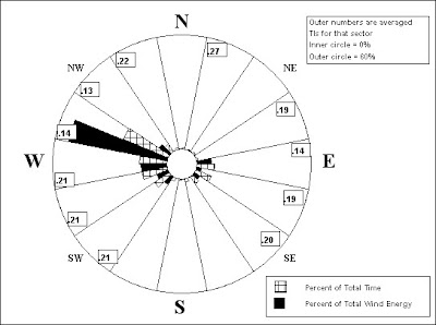
The windrose testing graph to the left was downloaded from windtesting.com. The focus is looking into setting up turbines, and therefore using alternative fossil fuel energy. Graphs like this are more than helpful in background research being done in order to try to move into a different technology.

The windrose picture's URL is from: http://images.google.com/imgres?imgurl=http://www.windtesting.com/windrose.jpg&imgrefurl=http://www.windtesting.com/2.html&usg=__5zFeER3c93XHZar4XGJaGgLXoH0=&h=405&w=543&sz=48&hl=en&start=37&um=1&tbnid=T2MOpRn8mA_BNM:&tbnh=98&tbnw=132&prev=/images%3Fq%3Dwindrose%26ndsp%3D18%26hl%3Den%26rls%3Dcom.microsoft:*:IE-SearchBox%26rlz%3D1I7GZFA%26sa%3DN%26start%3D36%26um%3D1

Climograph


This climograph represents the humidity and climate information for Timbo, Guinea in West Africa. It shows how the land goes through a sever dry season, and then an intense tropic season.

The URL for this/these pictures is: http://images.google.com/imgres?imgurl=http://www.sci.uidaho.edu/scripter/geog100/lect/06-climates/low-lat-climates/7-12-climograph-tropical-wet-dry.jpg&imgrefurl=http://www.sci.uidaho.edu/scripter/geog100/lect/06-climates/low-lat-climates/7-12-tropical-wet-dry-climograph.htm&usg=__E460c44KiUfxr_Ev4fKDapWO84Q=&h=413&w=361&sz=23&hl=en&start=7&um=1&tbnid=9oRweQXlm7QZrM:&tbnh=125&tbnw=109&prev=/images%3Fq%3Dclimograph%26hl%3Den%26rls%3Dcom.microsoft:*:IE-SearchBox%26rlz%3D1I7GZFA%26sa%3DX%26um%3D1

Population Profile


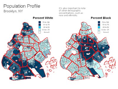
This population profile is also a choropleth map. These two maps show the percentage of white/black population households in Brooklyn, NY. This is a data copulated map so that the government in Brooklyn, NY, can know the demographics for different things that it will need to use in order to dole out need based programs.

Scatterplot


This scatter plot is an example of yeast cells and their genes. What they, specifically, have done is plotted a controlled group against a default group of cells. By plotting these datas together, but in different colors, it helps the user see the differences in the intensities really well.

This picture's URL is: http://images.google.com/imgres?imgurl=http://www.chem.agilent.com/cag/bsp/sig/images/tn_scatter_plot.gif&imgrefurl=http://www.chem.agilent.com/en-US/Support/FAQs/Informatics/GeneSpring%2520GX/Views/Pages/KB001111.aspx&usg=__dk6EEjornt2EXr-BPuYYfFu1ZDA=&h=499&w=576&sz=13&hl=en&start=14&um=1&tbnid=w4XJLbY8wRx8iM:&tbnh=116&tbnw=134&prev=/images%3Fq%3Dscatter%2Bplot%2Bdna%26hl%3Den%26rls%3Dcom.microsoft:*:IE-SearchBox%26rlz%3D1I7GZFA%26sa%3DX%26um%3D1

Histogram

This histogram is a compilation of data from the USDA's (forest service) ozone calculator. The data that is collected is then plotted onto a histogram to give a visual representation of the ground level ozone levels that have been collected.

The photo's URL is: http://images.google.com/imgres?imgurl=http://webcam.srs.fs.fed.us/calculator/images/histogram.gif&imgrefurl=http://webcam.srs.fs.fed.us/calculator/calculator.htm&usg=__n1tVbivLEqViZPn2S_ojI4cnaoQ=&h=364&w=389&sz=34&hl=en&start=80&um=1&tbnid=qhnMcXgtTExTCM:&tbnh=115&tbnw=123&prev=/images%3Fq%3Dhistogram%26ndsp%3D18%26hl%3Den%26rls%3Dcom.microsoft:*:IE-SearchBox%26rlz%3D1I7GZFA%26sa%3DN%26start%3D72%26um%3D1

Black & White Aerial Photo


Infrared Aerial Photo
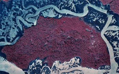


An Infrared aerial photo can loosely be described as "Photography in which an infrared optical system projects an image directly on infrared film, to provide a record of point-to-point variations in temperature of a scene." (answers.com). The photo to the left is an infrared photograph taken of Grover Island, and the colors clearly show that the top of the island/middle of the island (which is only 1.4 miles across...from east to west) seems to have the most activity/heat. The URL for this photo can be found at: http://images.google.com/imgres?imgurl=http://www.camdencountylandtrust.org/grover-aerial-for-web.jpg&imgrefurl=http://www.camdencountylandtrust.org/Grover%2520Island.htm&usg=__88QgpZ_sBXX9t42hp2htXp3Fytc=&h=310&w=497&sz=36&hl=en&start=40&um=1&tbnid=Afu4pMDoA6Z7EM:&tbnh=81&tbnw=130&prev=/images%3Fq%3Dinfrared%2Baerial%2Bphoto%26ndsp%3D18%26hl%3Den%26rls%3Dcom.microsoft:*:IE-SearchBox%26rlz%3D1I7GZFA%26sa%3DN%26start%3D36%26um%3D1

Tuesday

Bivariate Chloroleth map
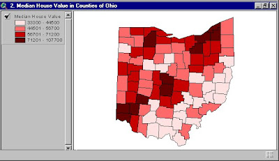

A bivariate chloropleth map is loosely defind by the fact that different colors are used to show no less than two different variables. What this means is that the picture at the left portrays different mean incomes across the State of Ohio. The URL for this site is: http://images.google.com/imgres?imgurl=http://gis.esri.com/library/userconf/proc99/proceed/papers/pap171/p1712.jpg&imgrefurl=http://gis.esri.com/library/userconf/proc99/proceed/papers/pap171/p171.htm&usg=__uD4P2FlZlF_cHz3qxOs5mAsouZs=&h=368&w=638&sz=45&hl=en&start=18&tbnid=Swd4yK7OA46fjM:&tbnh=79&tbnw=137&prev=/images%3Fq%3DBivariate%2BChoropleth%2Bmap%26gbv%3D2%26hl%3Den%26sa%3DX

Classed Chloropath Maps


A classed chloropath map is another means by which to protray data. The map to the left is that of the State of Delaware, and is income based.

Range Graded Proportional Circle Map


A range graded proportional circle map is supposed to be a proportional circle map that "better" represents data circles with relation to their data. The map to the left better depicts the range (size and color wise) that seems to better represent its data. The URL for the map to the left is: https://blogger.googleusercontent.com/img/b/R29vZ2xl/AVvXsEjSF91vjH2s9YtJX6-PGpGNDKUZIh36GUBEKa_EF6uzDgXqEae3v5EITLKuhJV__eIyOKYaSy3widJ3vHCGIUYd9yjulItCeAF8XHJlnEbxUMTE7BNaVleZ8pfz3nEPrs0si_OrYmLrh3eo/s320/Range+graded+proportional+circle+map.gif

Continuously Varibale Proportioanl Circle Map
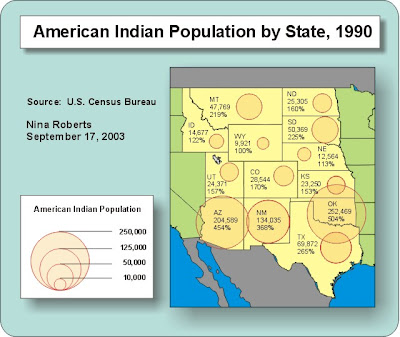


A continuously variable proportional circle map is, apparently, a map which uses circles to create "point data." The photo on the left is a map, with info dated September 17, 2003, was compiles to show Native American populations by certain states. Its URL is: http://vin25maps.blogspot.com/2009/04/continuously-variable-proportional.html

ISOBAR
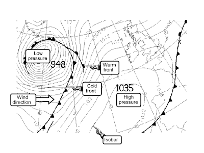


ISOBAR, essentially, utilizes a line to connect areas with equel atmospheric pressure(s). The map to the left is for a "swell" forecast (for surfuers), and has an emphasis on the Atlantic. The URL for this map is: http://images.google.com/imgres?imgurl=http://www.swell-forecast.com/en/tutorials/info_isobar_e.gif&imgrefurl=http://www.swell-forecast.com/en/tutorials/isob_e.htm&usg=__nWK07OgmB_gWsv5FCAZjWIs1oh8=&h=432&w=576&sz=24&hl=en&start=5&tbnid=mepsPbtKo5zsAM:&tbnh=101&tbnw=134&prev=/images%3Fq%3DISObar%26gbv%3D2%26ndsp%3D18%26hl%3Den

LIDAR
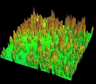


LIDAR radar is very similar to radar except that it uses laser lights instead of microwaves to produce its images. The picture to to the left Three-dimensional Image of is a canopy Structure with Pulsed LIDAR. This image's URL was taken from: http://images.google.com/imgres?imgurl=http://nature.berkeley.edu/biometlab/images/Lidar%2520sample%2520Tonzi.jpg&imgrefurl=http://nature.berkeley.edu/biometlab/fieldpics.html&usg=__6BTeDIBI8B6wNTtvBDCnxEzkG70=&h=478&w=545&sz=120&hl=en&start=32&tbnid=UJkidOms6N9ynM:&tbnh=117&tbnw=133&prev=/images%3Fq%3Dlidar%26gbv%3D2%26ndsp%3D18%26hl%3Den%26sa%3DN%26start%3D18

Followers