
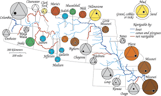
A range graded proportional circle map is supposed to be a proportional circle map that "better" represents data circles with relation to their data. The map to the left better depicts the range (size and color wise) that seems to better represent its data. The URL for the map to the left is: https://blogger.googleusercontent.com/img/b/R29vZ2xl/AVvXsEjSF91vjH2s9YtJX6-PGpGNDKUZIh36GUBEKa_EF6uzDgXqEae3v5EITLKuhJV__eIyOKYaSy3widJ3vHCGIUYd9yjulItCeAF8XHJlnEbxUMTE7BNaVleZ8pfz3nEPrs0si_OrYmLrh3eo/s320/Range+graded+proportional+circle+map.gif
No comments:
Post a Comment