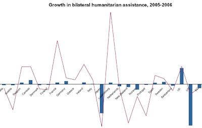
The bilateral graph to the left represents the growth (and lack thereof) in humanitarian assistance for multiple countries.
Though the graph can be go to by visiting globalhumanitarianassistance.org, the simplest URL I found for it was: http://images.google.com/imgres?imgurl=https://blogger.googleusercontent.com/img/b/R29vZ2xl/AVvXsEivuhTXG7axMicd9hf7RF67Cxu7xQq7Z0TogOSwNdlBGsMHfLtcZKkC-2t-Fml267YKMJxjftPMJFoVIsC2l8EmQkGUAY3gto3pzBBR_0sHb2-pionpFx2hbjjdy4yKvAoXvoVZIjZA14E/s320/bi-lateral+graph.jpg&imgrefurl=http://mavance2000.blogspot.com/2008/07/bilateral-graph.html&usg=__rVa9xdTBDckGH9YzGkhIkolNVNY=&h=86&w=135&sz=2&hl=en&start=5&um=1&tbnid=S19S5fogCLLqKM:&tbnh=59&tbnw=92&prev=/images%3Fq%3Dbilateral%2Bgraph%26hl%3Den%26rls%3Dcom.microsoft:*:IE-SearchBox%26rlz%3D1I7GZFA%26um%3D1
No comments:
Post a Comment