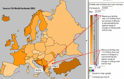
The unclassed choropleth map to the left is one that shows fertility rates in Europe. However, because it is an unclassed choropleth map, the shading of other countries fertility rates are directly related to the country with the highest fertility rate....which sets the shade so to speak.
Monday
Subscribe to:
Post Comments (Atom)
Followers
Blog Archive
-
▼
2009
(50)
-
▼
April
(49)
- Unclassed Choropleth Maps
- Standardized Choropleth Map
- DOQQ
- DRG
- DLG
- DEM
- Bilateral Graph
- Lorenz curve
- Index Value Plot
- Isopleths
- Isopach
- Isohyets
- Isotachs
- Cartographic Animations
- Isoline Map
- Hypsometric Map
- Cadastral Map
- Star Plot
- Correlation Matrix
- Similarity Matrix
- Stem & Leaf Plot
- Parallel Coordinate Graph
- Box Plot
- Triangular Plot
- Windrose
- Climograph
- Population Profile
- Scatterplot
- Histogram
- Black & White Aerial Photo
- Infrared Aerial Photo
- Bivariate Chloroleth map
- Classed Chloropath Maps
- Range Graded Proportional Circle Map
- Continuously Varibale Proportioanl Circle Map
- ISOBAR
- LIDAR
- Doppler Radar
- Statisical Maps
- Proportional Circle Maps
- Chloropath Maps
- Cartogram
- Flow Map
- DOT Distribution Map
- Propaganda Maps
- PLSS Maps
- Thematic Map
- Topographic map
- Planimetric map
-
▼
April
(49)
No comments:
Post a Comment