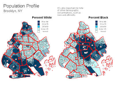
This population profile is also a choropleth map. These two maps show the percentage of white/black population households in Brooklyn, NY. This is a data copulated map so that the government in Brooklyn, NY, can know the demographics for different things that it will need to use in order to dole out need based programs.
Sunday
Subscribe to:
Post Comments (Atom)
Followers
Blog Archive
-
▼
2009
(50)
-
▼
April
(49)
- Unclassed Choropleth Maps
- Standardized Choropleth Map
- DOQQ
- DRG
- DLG
- DEM
- Bilateral Graph
- Lorenz curve
- Index Value Plot
- Isopleths
- Isopach
- Isohyets
- Isotachs
- Cartographic Animations
- Isoline Map
- Hypsometric Map
- Cadastral Map
- Star Plot
- Correlation Matrix
- Similarity Matrix
- Stem & Leaf Plot
- Parallel Coordinate Graph
- Box Plot
- Triangular Plot
- Windrose
- Climograph
- Population Profile
- Scatterplot
- Histogram
- Black & White Aerial Photo
- Infrared Aerial Photo
- Bivariate Chloroleth map
- Classed Chloropath Maps
- Range Graded Proportional Circle Map
- Continuously Varibale Proportioanl Circle Map
- ISOBAR
- LIDAR
- Doppler Radar
- Statisical Maps
- Proportional Circle Maps
- Chloropath Maps
- Cartogram
- Flow Map
- DOT Distribution Map
- Propaganda Maps
- PLSS Maps
- Thematic Map
- Topographic map
- Planimetric map
-
▼
April
(49)
No comments:
Post a Comment