Monday

Cartographic Animations


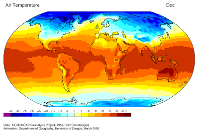
The cartographic animation to the left, when seen in motion, shows the air temperature from 1959 through 1997. This was created, or at least published, by The University of Oregon in March of 2000. What the viewer can see is an actual progression of all the months of all the years that this study contains data for.

Its URL is: http://images.google.com/imgres?imgurl=http://uwacadweb.uwyo.edu/JSHINKER/animations/global/gifs/vmag500winds_web.gif&imgrefurl=http://uwacadweb.uwyo.edu/JSHINKER/animations/global/index.html&usg=__c6-ISlNc9_abWLDpvtG-AaXqeAo=&h=458&w=674&sz=455&hl=en&start=14&um=1&tbnid=SttdNmDh9QuDBM:&tbnh=94&tbnw=138&prev=/images%3Fq%3Dcartographic%2Banimations%26hl%3Den%26rls%3Dcom.microsoft:*:IE-SearchBox%26rlz%3D1I7GZFA%26sa%3DN%26um%3D1

No comments:

Post a Comment

Followers